Modal Sketches
A photo composite project
‘Modal Sketches’ is based on the studio album Kind of Blue, by American Jazz trumpeter-composer Miles Davis. Recorded at Columbia’s 30th Street Studio in New York City, it is a homage to his life, his experiences, his influences and most importantly, his practice. His work exceeds profound excellence because of his creative approach to the album.
Kind of Blue is that album which encouraged me to think of Jazz differently. What intrigued me was it’s absolute brilliance in its melody and composition as well as the emotions it provoked within me. It was the first Jazz album I had heard and appreciated, and I wished to express that through this composition.
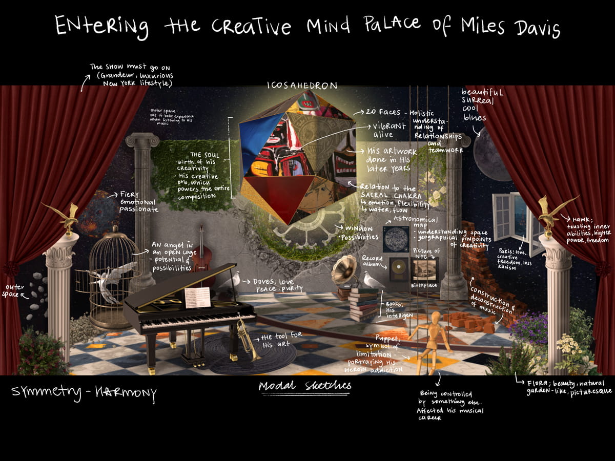
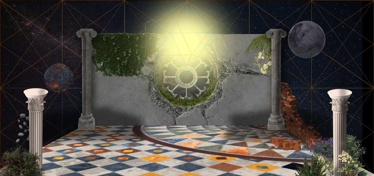
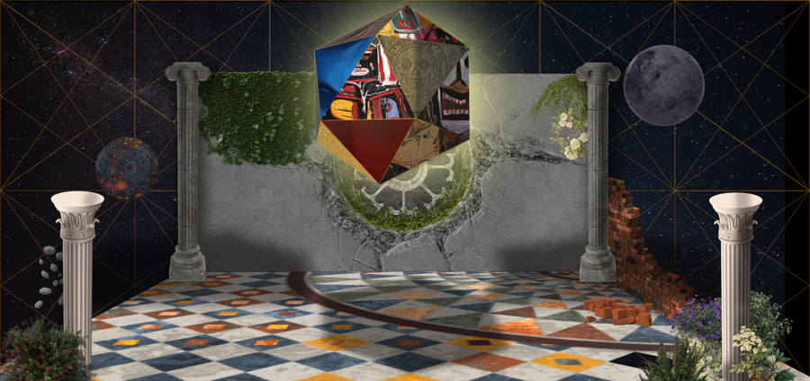
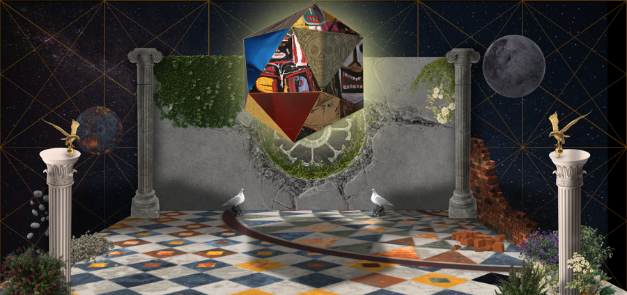
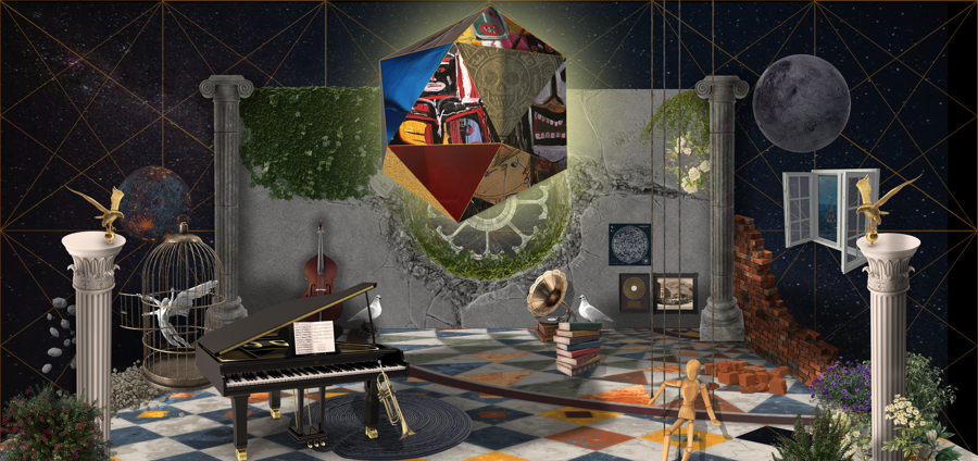
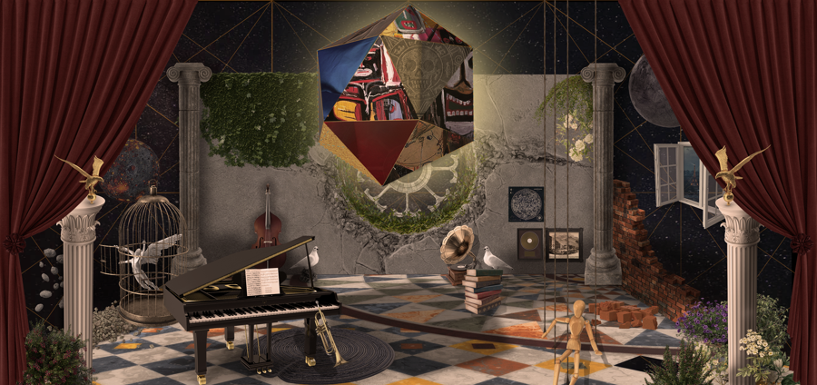
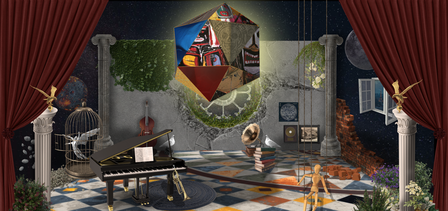
This photo composite is an insight into the creative mind palace of the artist. It encompasses narratives of his life, his inspirations, and his art, which he pursued in his later years. The central geometrical structure is an icosahedron with Davis’s art superimposed onto each of the visible faces.
It represents the creative soul in the form of a geometrical orb, which powers the entire composition. Surrounding it are elements of his life, small snippets which proved significance to me, pertaining to his heroin addiction, romantic relations, racism and creative freedom. Overall, the setting is suspended in space, depicting the out of body experience one feels when listening to the album.
It represents the creative soul in the form of a geometrical orb, which powers the entire composition. Surrounding it are elements of his life, small snippets which proved significance to me, pertaining to his heroin addiction, romantic relations, racism and creative freedom. Overall, the setting is suspended in space, depicting the out of body experience one feels when listening to the album.
I wanted to create a surrealist depiction of his music, with hints of modernity, coupled with the eternal feeling of living through this album during any time period.
Where It All Began
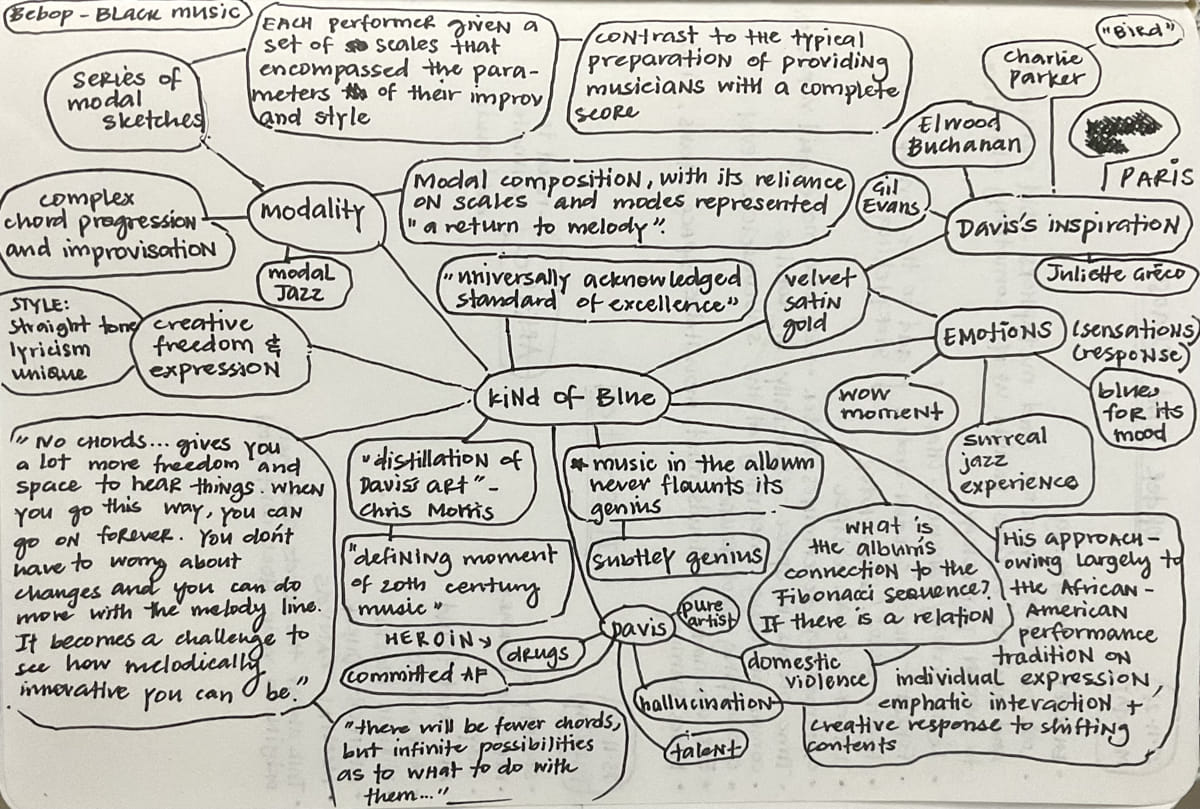
I began this composition by exploring the most impactful music to me, visually and emotionally. After skimming through my playlists, I narrowed my search to Miles Davis’s Kind of Blue album. It evoked memories of moments when I felt deeply connected and envisioned breathtaking imagery from the music.
As I delved deeper into my research, I discovered a stronger affinity for the visuals associated with “Kind of Blue”. This album held a significant place in my heart as it was the first jazz album I ever experienced and adored, marking the inception of my fascination with the genre. Consequently, I chose to craft my composition as a tribute to Miles Davis, paying homage to his life, influences, and the genesis of his creative zenith through his music.
Immersing myself in documentaries about his life, scouring articles detailing the album’s release, and immersing in the creative aura surrounding this remarkable artist and his body of work, my mental imagery grew increasingly vivid with each listen to the album.
I explored numerous grids in Matila Ghyka’s book on Harmonic Symmetry and tried to understand the importance of grids in space. I was introduced to complex grids with attention paid to pentagons and pentagrams. Furthermore, I discovered the Icosahedron, a 20-faced geometric shape. It’s relevance to my final composition was intriguing, as I explored the significance of the number 20, its relation to the Sacral Chakra in the human body and its connection to flow, water, creativity and harmony, similar to what Miles Davis tried to achieve in his album.
Furthermore, the idea of harmonic symmetry, as explored by Jay Hambidge and Ghyka was interesting to me, as it resonated with Davis’s music sheets for the album which embodied harmonic modality, allowing for the album to explore the highest level of creative freedom in Jazz at the time.
“When you’re creating your own shit, man, even the sky ain’t the limit.”
– Miles Davis
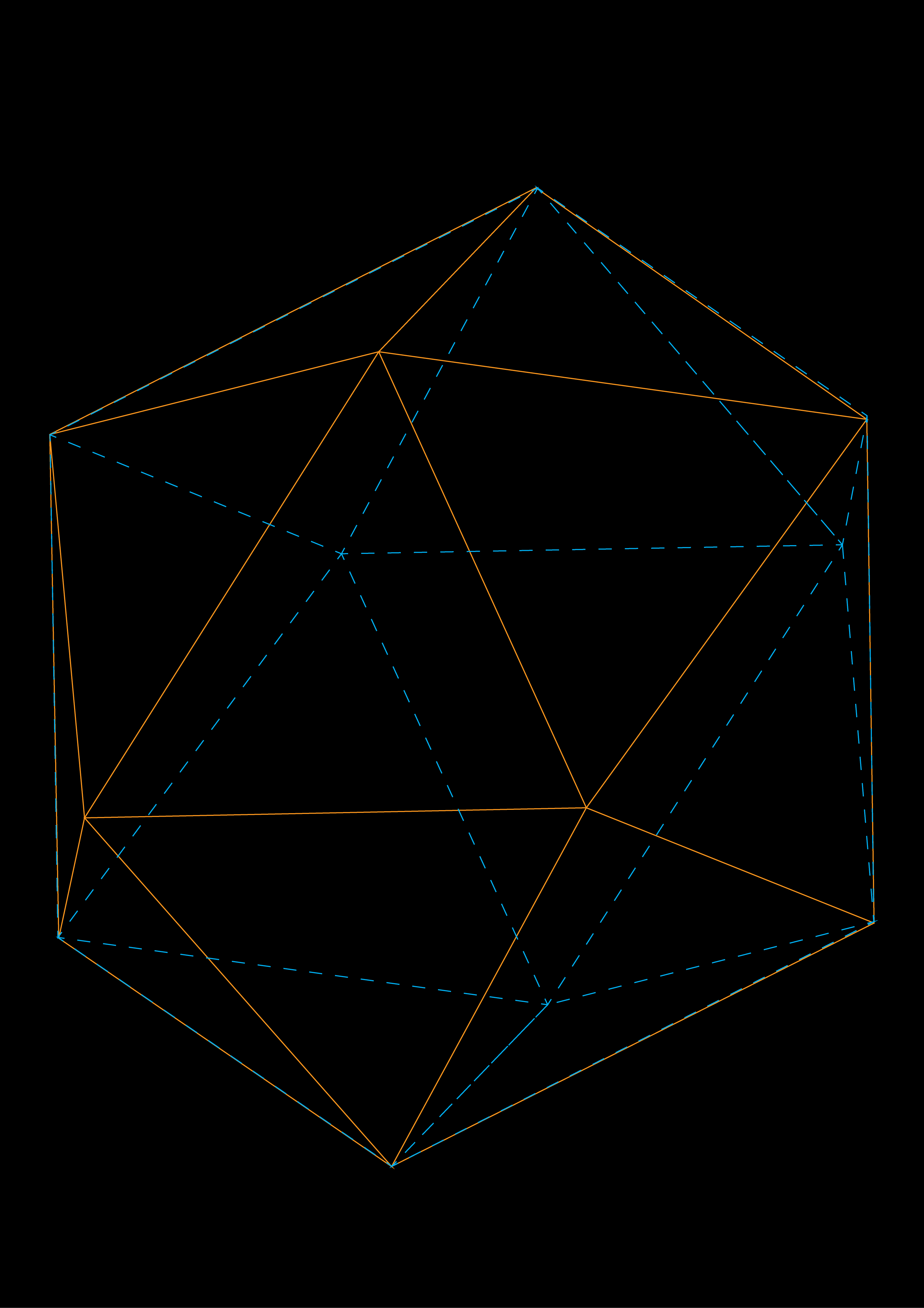
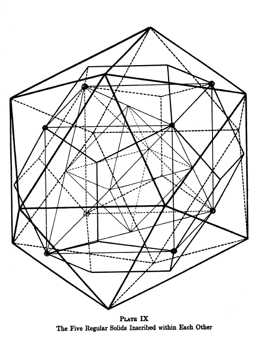
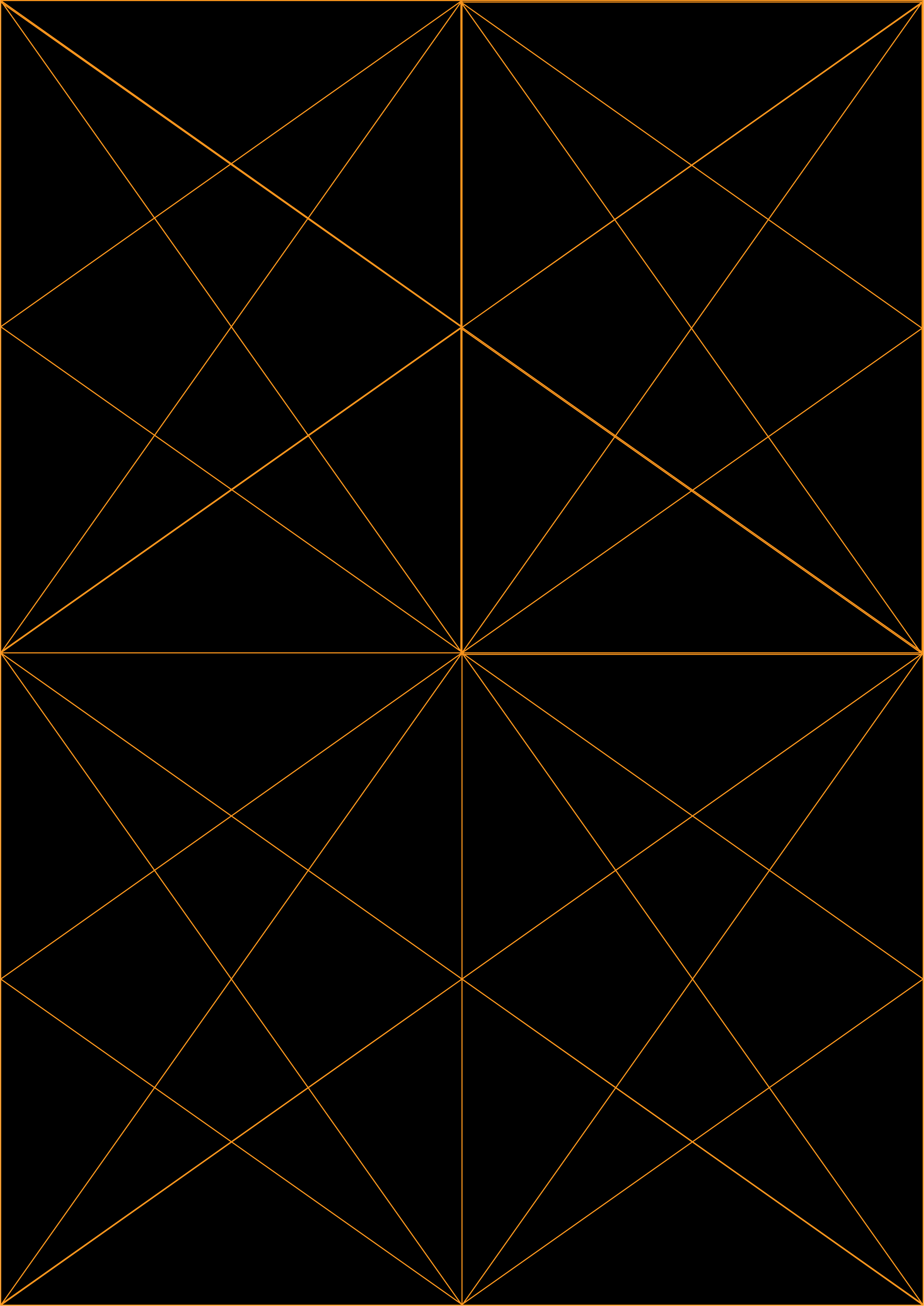
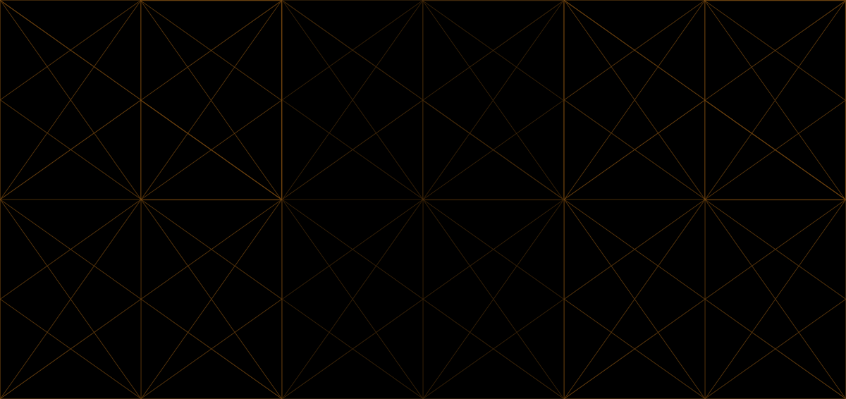
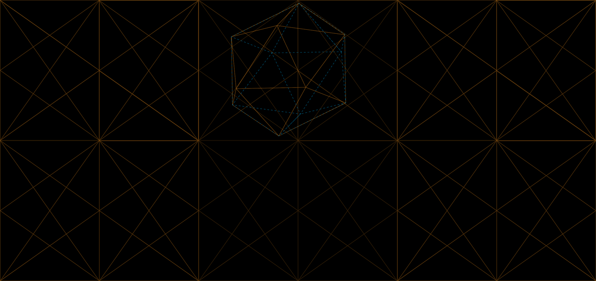
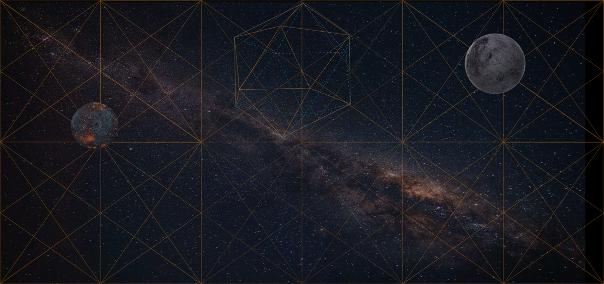
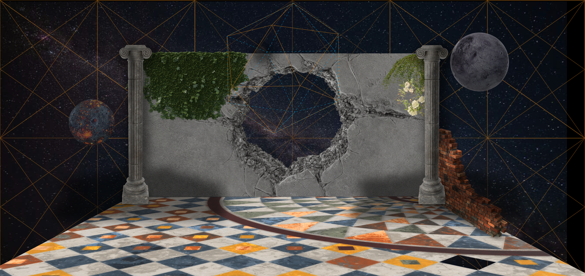
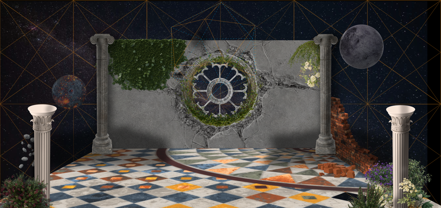
Initially, I started my research on how root rectangles and phi rectangles overlapped create interesting grid structures for my compositions. I realized the more complex they get, the more difficult it is to create work around them. There was beauty in the simplicity of the grids when not overlapped, or when placed in certain positions to create an aesthetically pleasing visual as well as a connecting network of baroque and sinister angles.
I explored with root 2 and phi rectangles, carefully overlapping them to create manageable patterns which fit with the work I wanted to create.

1 digital illustration
softwares: photoshop & after effects
